SMOOSH JUICE
The False Dichotomies of RPG Design

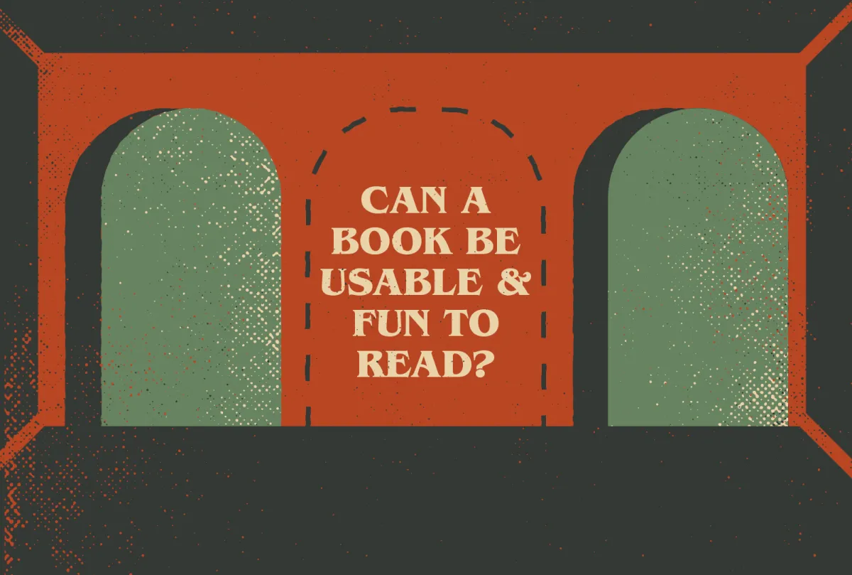
Tabletop rpg design is plagued with either-or fallacies. “A book can be usable at the table, or it can be fun to read,” is just one of them.

Let’s reject the either-or fallacy.
Today’s article is a short one and can be summarized in four words: “You can do both.” I’m lurking in discords, watching videos, and reading blogs (so, so, so many blogs). A lot of debates or dilemmas in tabletop rpgs are presented as binary decisions, when in reality, many choices exist.
Here are just a few of the industry’s favorite mutually exclusive fallacies…
“Is your game hyper-usable or fun to read?”
Well-written games can be fun to read and be usable. I think this false dilemma emerges naturally as a result of porting expectations from other mediums. If we’re judging an rpg’s writing and flow by how much it feels like reading a novel, we’re forced to ignore the things novels don’t do and tolerate what RPGs can do.
However, if we expand that definition of enjoyable reading to other formats like poetry, the spoken word, screenwriting, or even chewy technical writing (it exists), suddenly the functional form of an rpg and its creative merits are not mutually exclusive. It can be both.
Examples that defy the false dilemma:
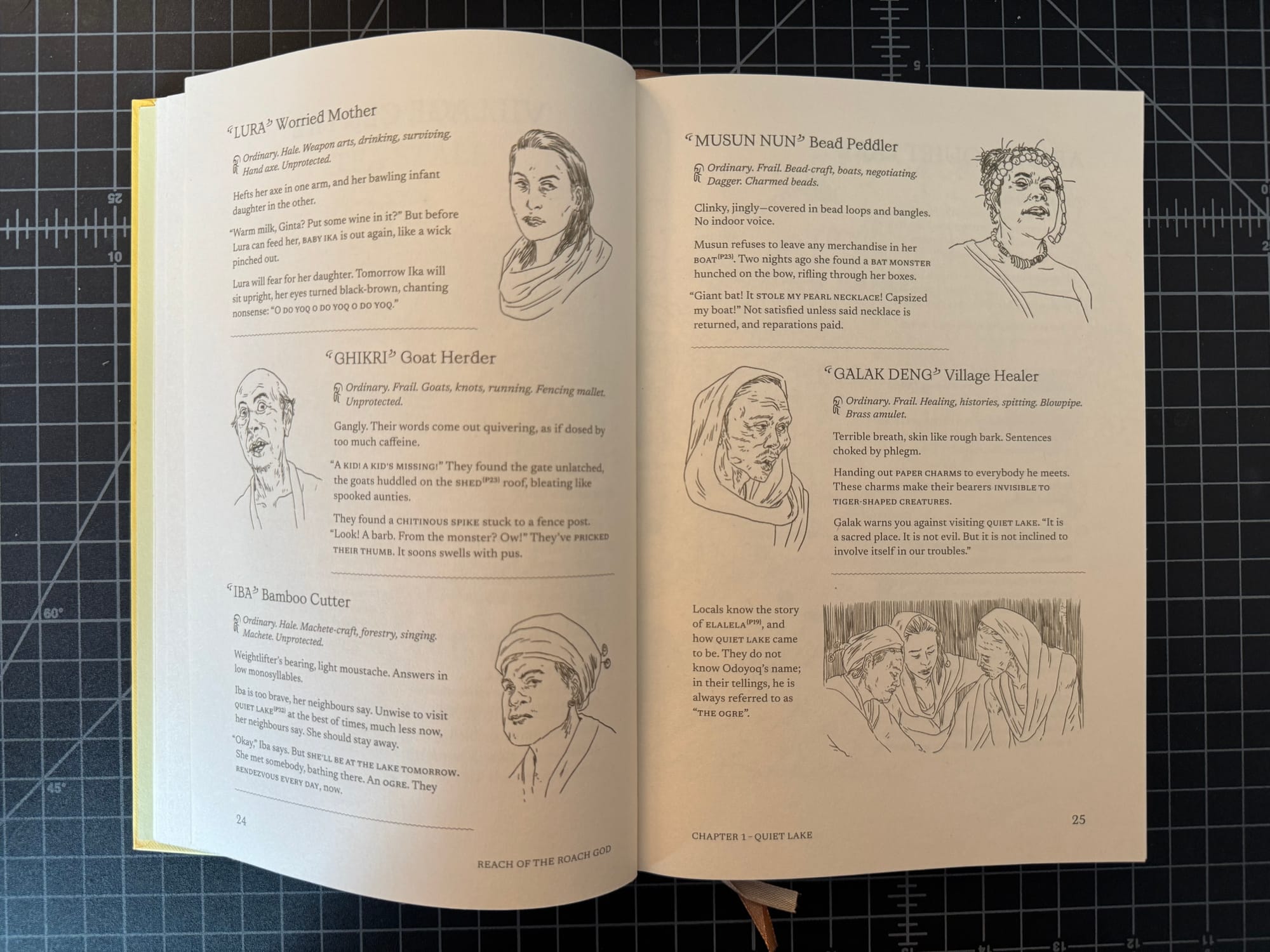
Reach of the Roach God. Airy, pithy, and not afraid to use technical elements, and yet every bullet point, mechanic, and morsel drips with potential energy. Zedeck Siew writes pictures with words.
Clinky, jingly — covered in bead loops and bangles. No indoor voice. Musun refuses to leave any merchandise in her boat. Two nights ago she found a bat monster hunched on the bow, rifling through the boxes…
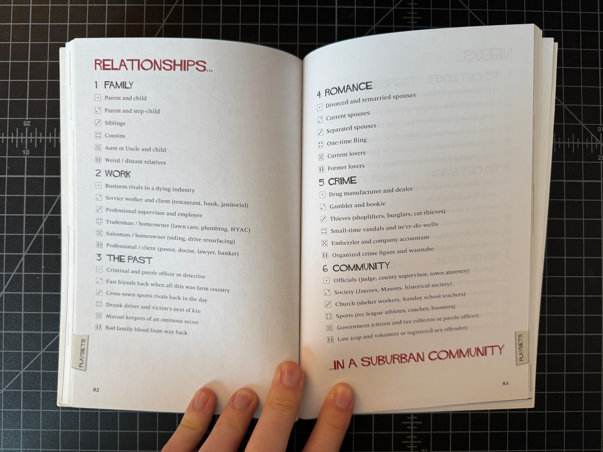
Fiasco. The majority of Fiasco’s creative writing is contained exclusively in the roll tables of its playsets, and yet once you know how the game works, the fun is in the potential of every noun when it’s combined with another at the table. The head brims with possibilities when you roll the dice and see the collection.
Characters: Weird distant relatives, separated spouses, and a local church group. Objects: A broken police ankle monitor, a pedigreed champion dog, and a Klingon sword.
Winter’s Daughter. Likely the most pragmatic-seeming of the three examples, Winter’s Daughter is orderly, extensively keyed, and filled with formatting, and yet it’s still full of mythological imagery and lore. It’s fantasy by way of Hemmingway or Ian Fleming instead of Tolkien. Concrete, almost factual in style, but compelling in our collective imaginations.
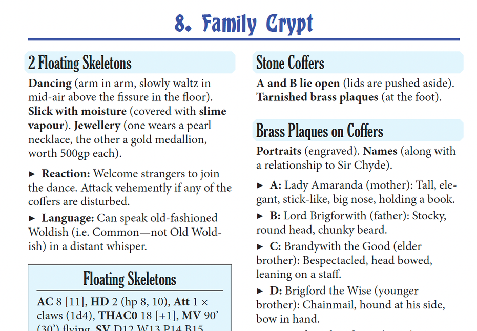
2 Floating Skeletons. Dancing arm in arm, slowly waltz in mid-air above the fissure in the floor. Slick with moisture (covered with slime vapour). One wears a pearl necklace, the other a gold medallion, worth 500 gp each.
“Do you fill empty space with art or text?”
It doesn’t have to be filled with anything. Sometimes the emptiness is the point. And sometimes the solution is a matter of evolution, not additon. If a page with only text is boring, that instance of text is boring. Spot art is just one solution.
Filling empty spaces with prose or spot art is a common practice in certain design traditions, including D&D, Call of Cthulhu, RuneQuest, and others. In reality, the aversion to white space is likely due to several factors, including adoption of the US letter paper size (which is quite large), a rigorous assembly line workflow (components made separately then combined last), large art budgets, and a social tradition of verbose high-crunch, high-prose writing.
With those factors, the easiest solution for composing spreads—the solution those teams are good at—is to fill them. Revising the copy, art, layout, paper size, or planning for whitespace, by comparison, isn’t just hard—it’s risk averse.
Examples that defy this false dilemma:
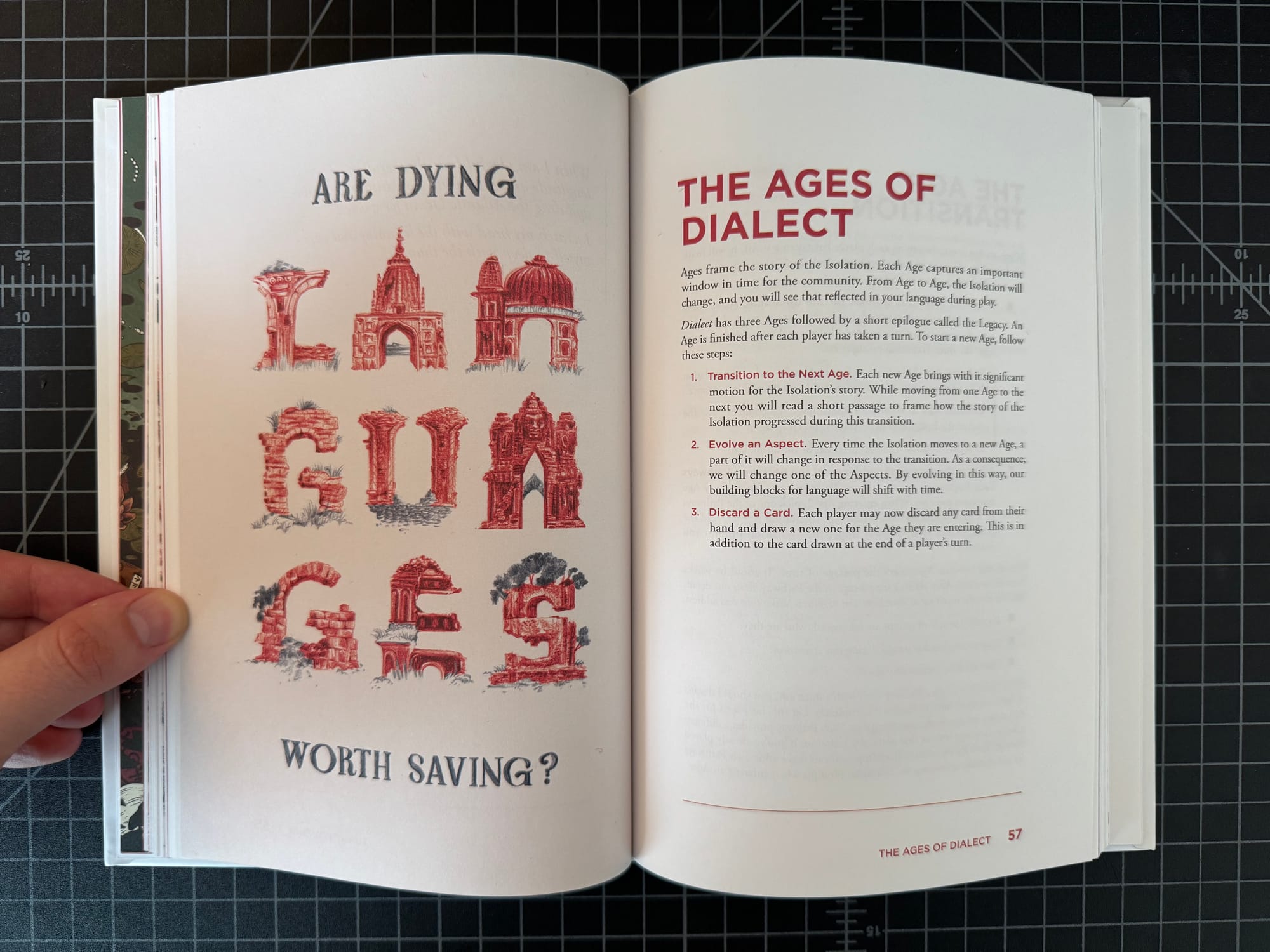
Dialect. In Dialect, the chapters often have empty space on the opposite page of its art, but the book never feels empty. This is for several reasons. First, the type scales in size from big titles to delicate type to give the text shape and form. Indentations make the prose less heavy and plodding, which makes the whitespace less stark in the text’s absence. Meanwhile, the markers and delicate line at the bottom of the page ensures there’s still a visual frame and anchor to the overall spread that balances the asymmetrical distribution of ink.
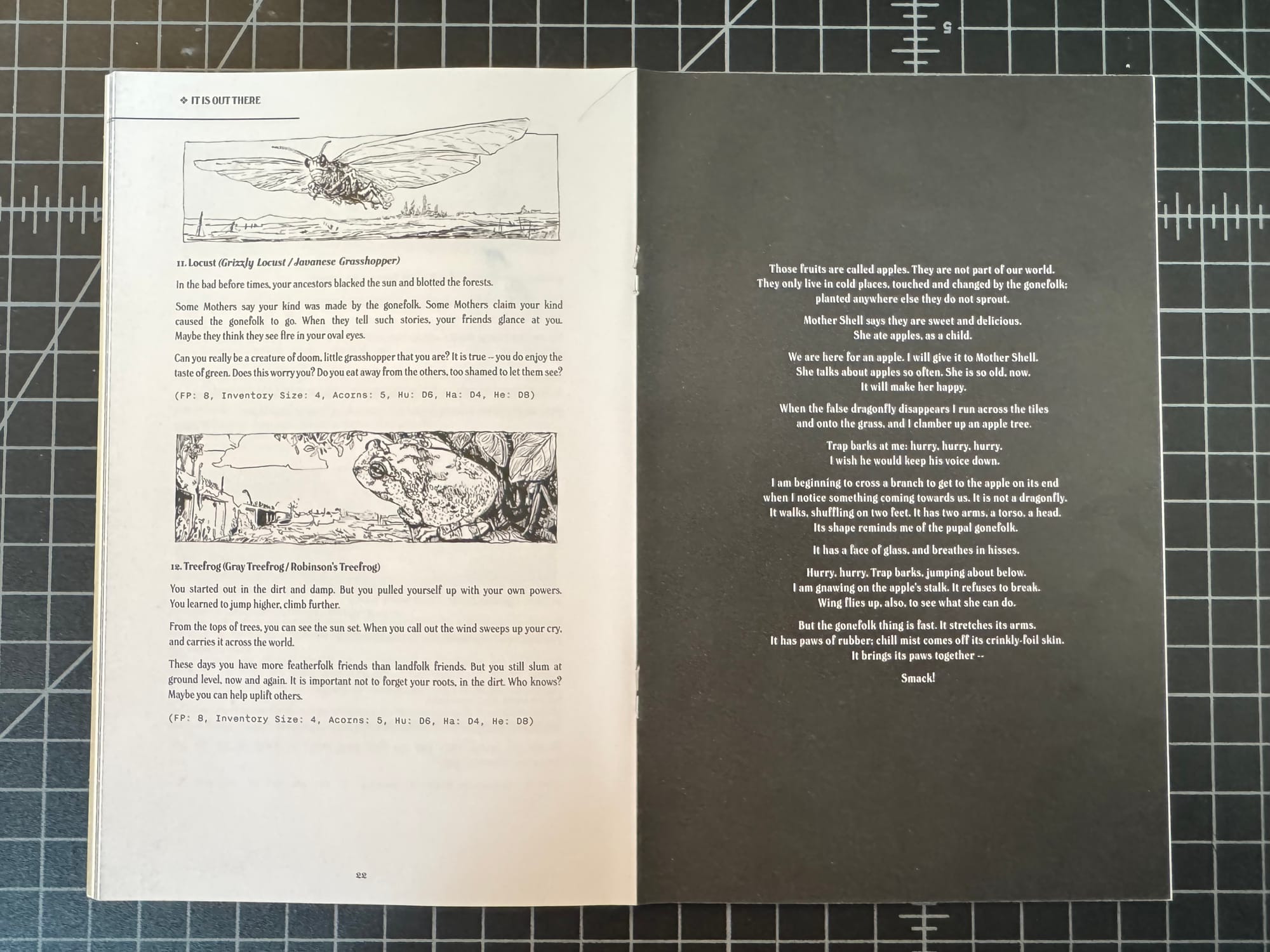
In The Light of a Faded World. This game has an entire page with just prose that doesn’t fill the page, but the prose is treated like prose and given all the classic typesetting considerations as a result. The text is positioned on its own, on black, in centered justification. It’s deliberately isolated, and in this restrained instance, the empty space makes it dramatic.
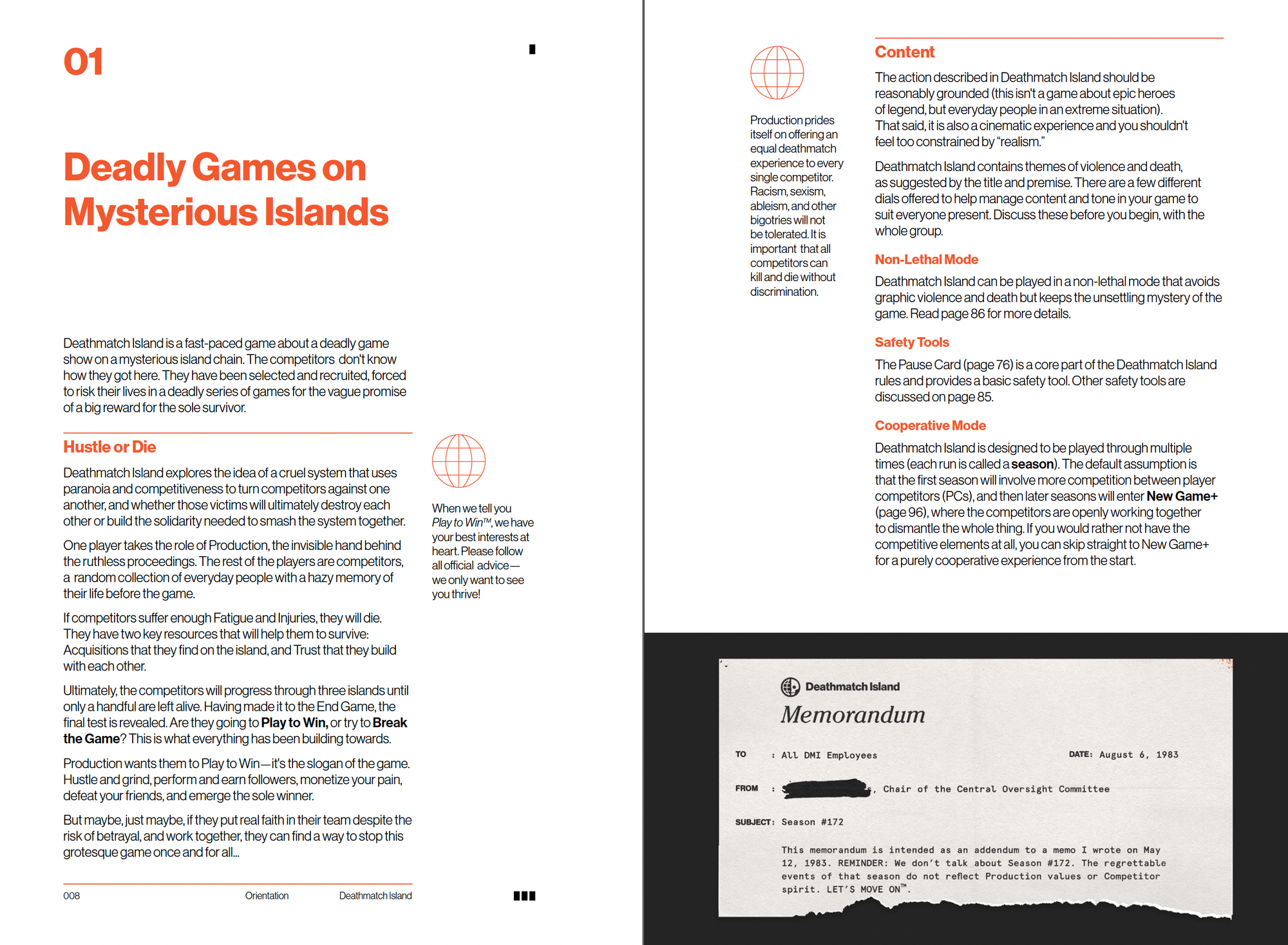
Deathmatch Island. This beauty of a book is defined by its use of white space, especially in the inner margins and sidebars. It’s style, sometimes called The Swiss Style, is defined by asymmetry, sans serifs, and clean (often sterile) grids. Without the white space, Deathmatch Island’s layout would feel more organic, dense, and balanced—and not what the game is about—corporate cruelty, bureaucracy, and the horrors of modernism.
“Is your game rules-lite or rules-heavy?”
This is a moving target. Or rather, multiple moving targets in multiple players heads. What is a rule and what makes it “crunchy” is too subjective to measure. Some think the fewer the mechanics, the lighter the game, while others find the lack of scaffolding and the resulting void taxing to roleplay and adjudicate—ie “heavy.” Then there’s the other question of when? Most games are not homogenous in their design.
The much more interesting question is, “In what ways is your game rules-lite or rules-heavy?” Or even just, “What does your game’s design feel like?” Or, “What is your game designed for?” The answers to all of these is far more informative, compelling, and specific to the game in question.
Still, this is mostly a harmless, if somewhat loaded, question. If it doesn’t break out of containment and stays in just one target audience (ie: dungeon-crawling elf games,) all that’s lost is an opportunity to be more specific.
The worse questions are the distantly related cousins:
- Is your game good for campaign play or easy to pick up and play?
- Is your game for sandbox-style play or railroad-style play?
The answer to these questions depends on the designer’s imagination and quality of work, because most of the really good games do a little bit of both…
Examples that defy this false dilemma:
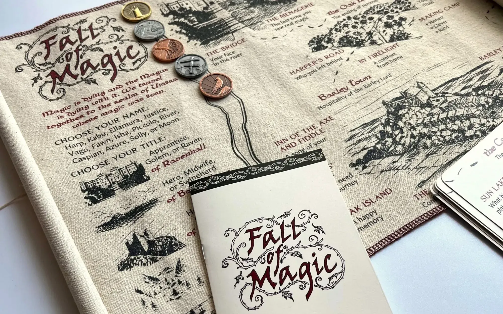
Fall of Magic. Ross Cowman’s Fall of Magic is maybe the poster child of games described as “rules-lite” and “one-shot” that get stretched into months-long campaigns. (I still remember when this game was described as exclusively a short affair, now I see campaign play on the packaging.) Undoubtably, if you ask most designers, they’ll call this game rules-lite. Its mechanics mostly ask questions and leave the players to form collaborative answers, but it’s in that empty space that some players find depth and ever-changing dynamics at play.
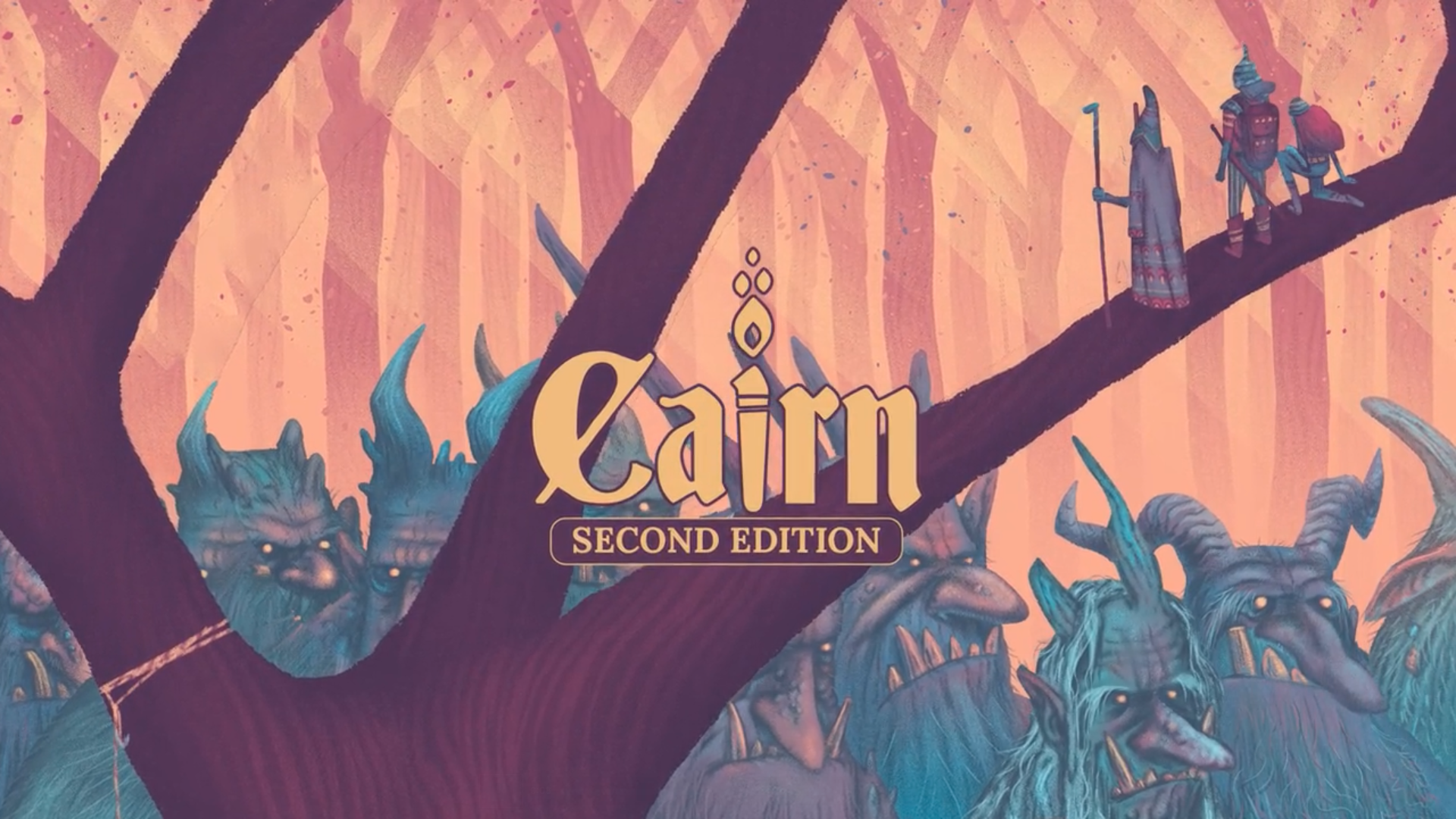
Cairn 2E. Like other games descended from Into the Odd, Cairn 2E is just a handful of rules that can fit on an index card. The rest of the game is optional—invisible until needed—which makes it an excellent pick-up game. But that doesn’t mean it can’t support campaign play. Most OSR/NSR games like Into the Odd, B/X, Knave, and Mausritter even have massive campaign books and supplements. So despite the implication that it has to be one or the other, the answer is still, “It can be both.”
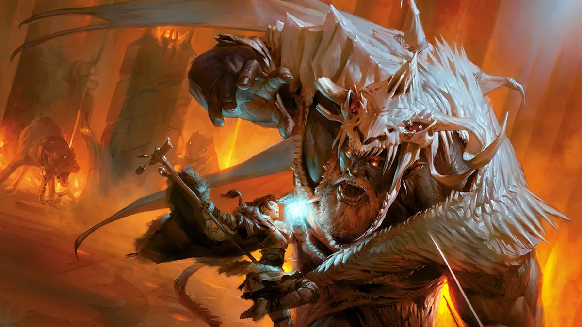
D&D 5E. I’m not going to suggest 5E is rules-lite. It definitely isn’t. But if we want an example of a game’s crunch not being uniform, I struggle to think of a more famous example. D&D is mechanically heavy but its core mechanic—the skill check—decidedly isn’t. Entire sessions sometimes run on skill checks. It’s arguably the spine of Actual Play’s best moments. It’s only when doing something else (or mostly everything else) like character creation, combat, or spellcasting that D&D is rules-heavy.
Final Thoughts on False Dilemmas
Most binaries aren’t real. Insisting otherwise is a failure of imagination, or refusing to glance at a bookshelf. Most of the either-or fallacies are just individual tastes masquerading as advice, or social conformity disguised as best practices.
Explorers Design is a production of Clayton Notestine. If you liked this article, please consider liking, sharing, and subscribing. Members who pay $5/month also get access to additional tools, templates, and inspiration.