SMOOSH JUICE
Designing a logo for Carouse, Carouse!
How I made the branding for Carouse, Carouse! A monthly party of an rpg newsletter full of rpg links, ideas, and gameable content.

I’ve never met a designer with the same process. You’ll see lineages—where they worked, who they worked for, and what work inspired them. I learned by watching and mimicking Aaron Draplin—a big, bearded guy who lives in the Pacific Northwest—Paul Rand (the guy who made the IBM logo), and my old mentor Sean O’Brien, a guy who knows the best kind of design is the kind that pays you enough to buy good coffee and fund fly fishing trips.
My process steals from all of them. Which got me thinking, maybe I can give some insight into my process? Adobe Illustrator is open on another window, the project should be nice and easy-ish, and I’m feeling like I can write as I go. I’ll take pictures and tell you what I’m doing.
But first, some working music…
#1 Research and strategize.
Today, I’m designing a quick and dirty logo for Carouse, Carouse! a collaborative newsletter with a raucous number of RPG articles and ideas from across the internet. I’m a collaborator—so I’m doing this for the love of the game(s).
Form a rough strategy. What is the idea of the thing?
I have to figure out what I’m designing for, and articulate the essence of the game, book, or project through rose-colored glasses. What is Carouse, Carouse! at its coolest, most interesting, and most relevant?
In branding, they call this part “the strategy.” What is the brand in abstract? How does this new identity make the brand speak to its audience yet stand out from the other brands trying to do the same thing?
This is the rough two-handed goal of any design project:
- Find (or make) an audience. My current job calls this “relevancy.” Who cares about this thing? What do they get from Carouse, Carouse! physically or emotionally? This is the underrated part of the strategy. It’s liberating because no brand is for everyone (not even the one you’re thinking of)—so you have full permission to make something idiosyncratic. A brand doesn’t need a lot of people to be successful—just some zealots—they’ll convert and draw in the rest, ala Mörk Borg, Mothership, or ShadowDark.
- Stand out from everyone else. How does this thing stand apart from other newsletters (including my design one, The Explorateur)? What makes it feel unique, fresh, and (dare I say) original? If you pick a fun, hyper-specific audience, this becomes much easier, but even without the audience, there’s still plenty of research to find that differentiation.
📙
Bonus Lesson: Don’t design for what it is. Design for what it should be. Something that makes the world less boring or ugly is a good start. If the idea is boring—the result will be boring.
Build the brand personality with attributes.
I sent a Google Doc to the rest of the Carouse, Carouse! crew. Normally I’d try to get on a call, or send them an interactive quiz, but we have one too many cooks in one too many timezones. And I’m in-between projects. A Google Doc will do… and now I’m realizing I should have been more specific with my wording.
“If Carouse, Carouse! were a person what would we be like? What are words that describe us that are unusual or interesting? Feel free to exercise a thesaurus.“
That’s what I should have written (I normally say that on calls). Still, we have some good words here from the crew… “uninhibited, scrappy, DIY, and loose.” The best words for the research phrase are evocative. The worst ones feel corporate, generic, or overly business-y. Fun isn’t bad, but it doesn’t imply in what way we’re fun. Specificity and originality is always best.
It’s funny. The rules for good brand strategy are the same as good room descriptions in adventure design. We don’t want casual, we want loose. We don’t want indie, we want scrappy. The goal is to conjure images in everyone’s head and start tickling the senses. What does the brand look, sound, and feel like? What does the grouping of words imply beyond their individual definitions?
📙
Bonus Lesson: The ideal attribute list is between 3 and 4 adjectives. The weirder the combinations, the more interesting the brand. For inspiration, I like to combine characters from movies and books.
Write a brand positioning statement.
Maybe it’s because I’m a writer and a graphic designer, but I like to think of brands in a metaphorical sense. I like to ask: how can I separate this brand from others by thinking of it as something other than what it literally is?
If you’ve worked in branding, you know what a positioning statement is. It’s a one-line description that declares how the brand is different. My approach is to say something unexpected right away. Don’t bother with the, “Carouse is an indie newsletter packed with fun ideas and gameable material.” That’s not differentiating (even if it says it is). I want an analogy or counter intuitive statement that defies expectations. Something that will continue to differentiate even when other newsletters are “packed with fun ideas.”
Remember: Clear and evocative strategy leads to clear and evocative design.
What is Carouse, Carouse? I have a vague image in my head… It’s a greeting. A fantasy tavern full of Star Wars-looking characters. It’s familiar, but not too familiar. There’s an orc behind the bar and maybe a dwarf arm-wrestling an elf, but it also has cyborgs, vampires, and an espresso machine. It sounds corny, but I’m literally thinking of the old show Cheers! Here’s what I’m going to write down…
Carouse, Carouse! is the tavern where every rpg world and player meets.
I’m writing this down along with “scrappy, loose, raucous, and eclectic.”
🖼️
Design Example: When I think of Explorers Design, I imagine a guild hall. It’s a league of explorers with layout and pencils swapped out for maps and sextants. It has a membership roster, brass plaques, and designs mounted on the wall like trophies.
#2 Create inspirational mood boards.
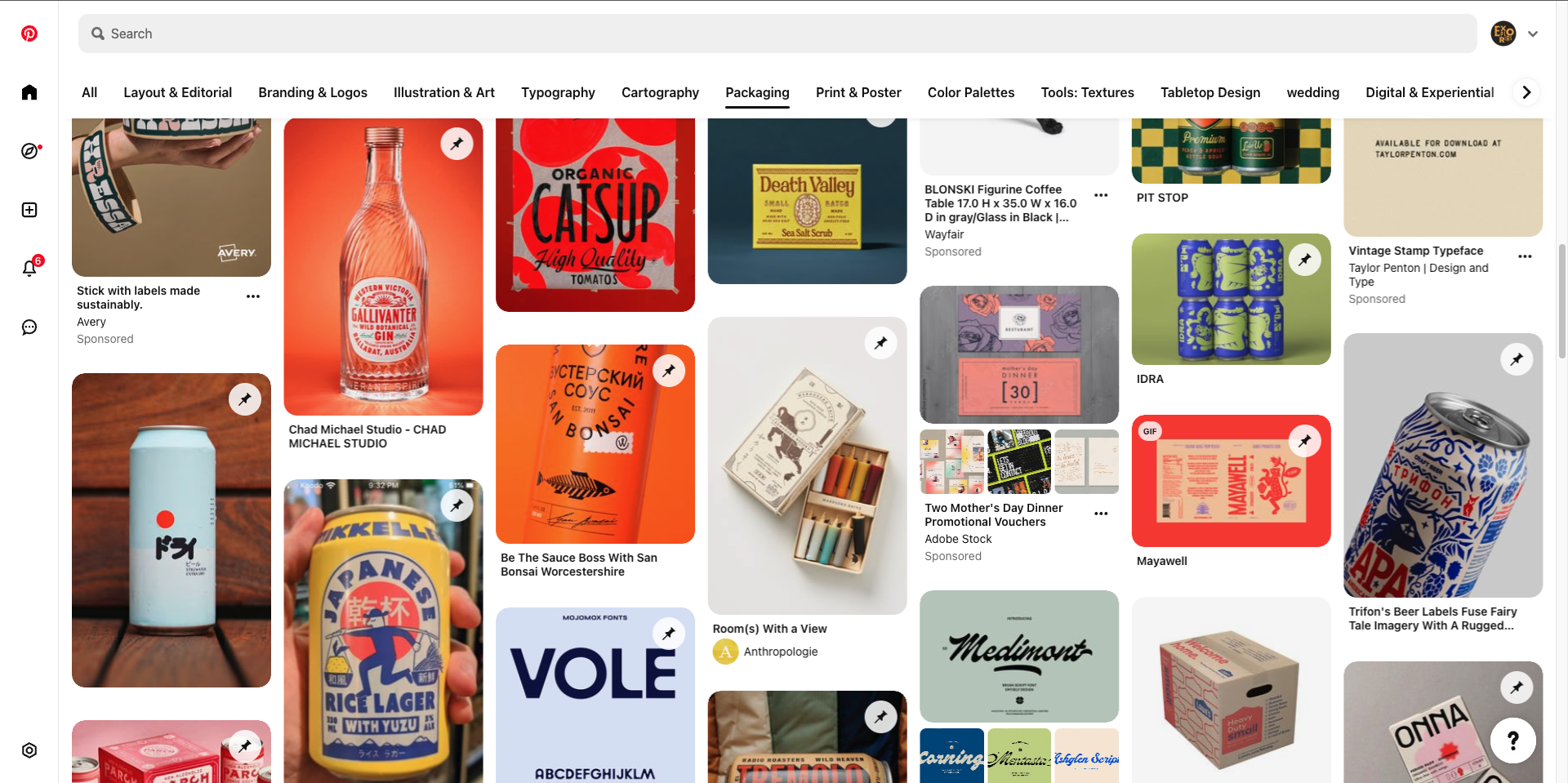
This is my favorite part of the process. No pressure. No clients. All I have to do is find and collect sources of inspiration. I do this with Pinterest, my Dropmark account, visiting the library, and surfing the internet. For those who don’t know, a “mood board” is just a collection of images and samples of things that feel like they can inform the design. In the old days, the mood board was a literal cork board full of images. Today, it’s mostly digital.
At this stage, the strategy (the positioning statement and attributes) are like a compass. They don’t limit what I’m collecting or getting inspired by, but they do point to what’s promising.
I have quite a few periodicals and art magazines from college—I’ll put those on my desk for inspiration. They feel eclectic just like Carouse. Normally I try to avoid looking at other brands, but I think the newsletter is niche enough that any similar brands are probably not what I’m going for. If I borrow elements from a pizza brand or a beer label, it’ll end up original by the time I’m done porting them over.
Huh. I’m getting weirdly inspired by Italian packaging on this project. Something about the big chunky letters on a tomato can speaks to me. It does feel a little raucous with its bright colors.
📚
Additional Reading: Paying members to this newsletter get access to my Dropmark folders with hundreds of agencies, brand guidelines, and layout inspiration. The rest of you can check out my Pinterest.
#3 Sketch rough ideas on paper.
Once I’ve collected some inspiration and filled my head with vague ideas, I start thinking of the positioning statement and start listing objects, characters, and concepts—wine cups, bar stools, tankards, a fireplace, etc. None of these stand out (one of the goals of the design project). The problem is that they’re too well trod. Every RPG forum, blog, and store has modeled themselves after a medieval tavern.
This is where I wonder if I should go back to strategy… No. No, I still think there’s a lot of cool opportunity here that other websites haven’t mined yet.
I’m looking at the attributes again… Scrappy, loose, raucous, and eclectic. It sounds loud, chatty, and maybe a little rowdy. Things that match that description in our imagined tavern-between-worlds:
- An electric lute playing music
- Two dissimilar cups clinking together
- A bard singing a song
- Talking, laughing, and yelling “NORM!”
- The sound of a old pub door swinging open
Music won’t work. It’ll make Carouse, Carouse! look like a tabletop music brand or a new flirty bard supplement… The world has enough of those already. I don’t really know how to make a wine cup and a tankard clinking together look good…
Alright, looking back at my list, I’m intrigued by the chatty visuals. It’s simple. If a little abstract. I think if I can find good type, that’ll give me something more literal to play with. I’ll make a note of this and come back to the symbol/logomark later.
📝
Reminder: It’s okay to say no to ideas because of your skillset. Especially if you don’t have time to learn. I try to learn or practice at least one technique while designing. Today’s won’t be illustration.
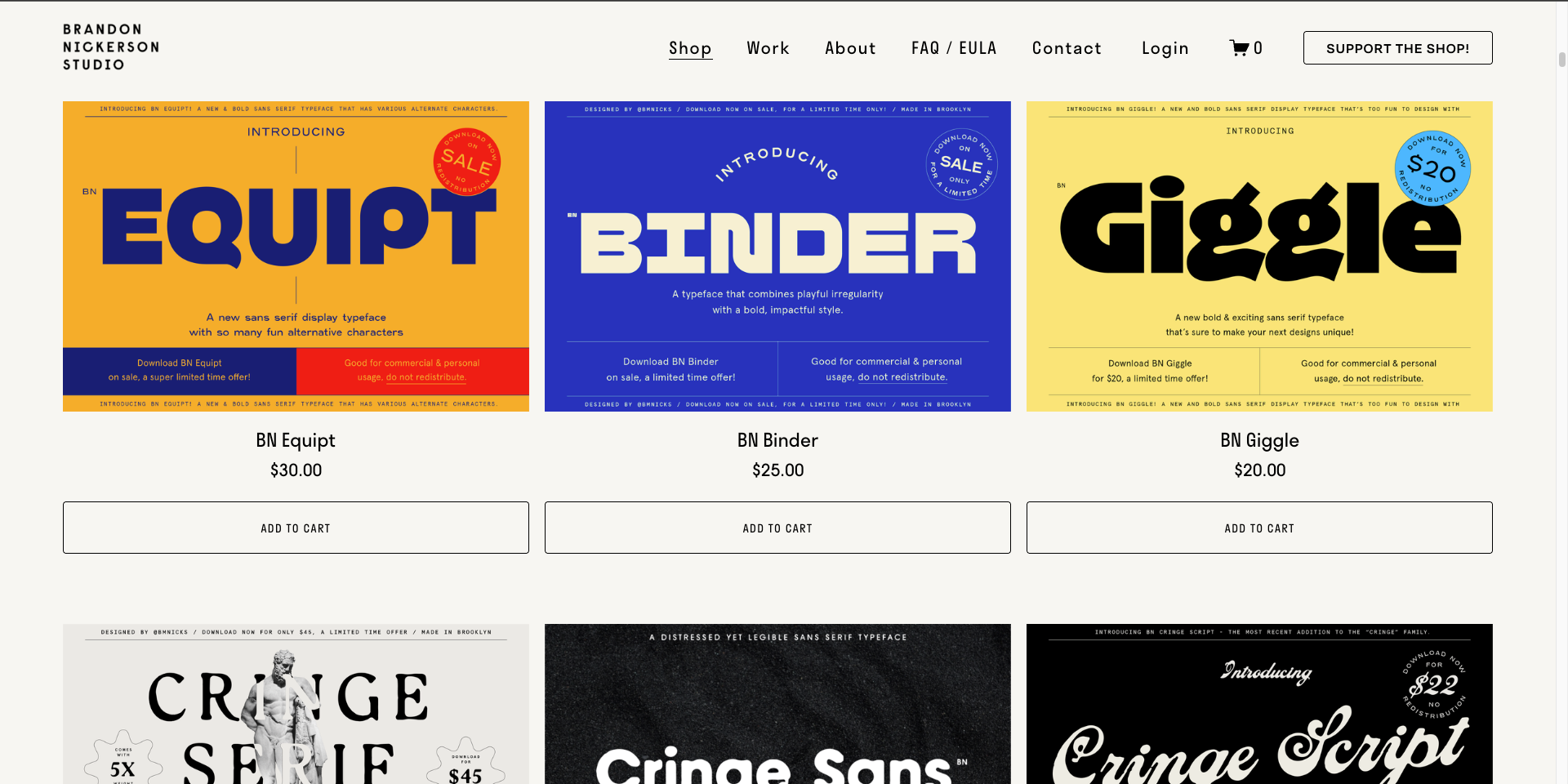
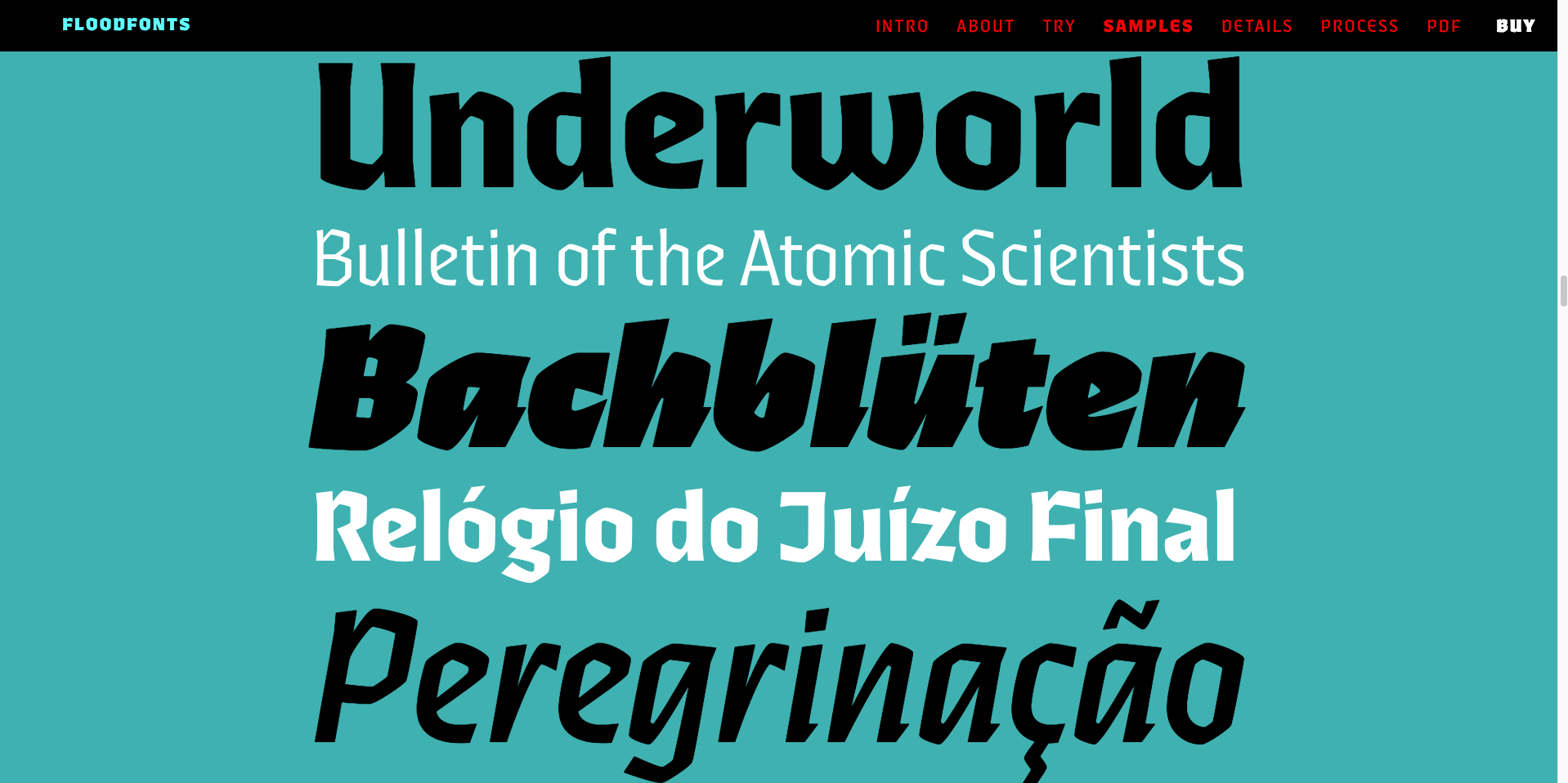
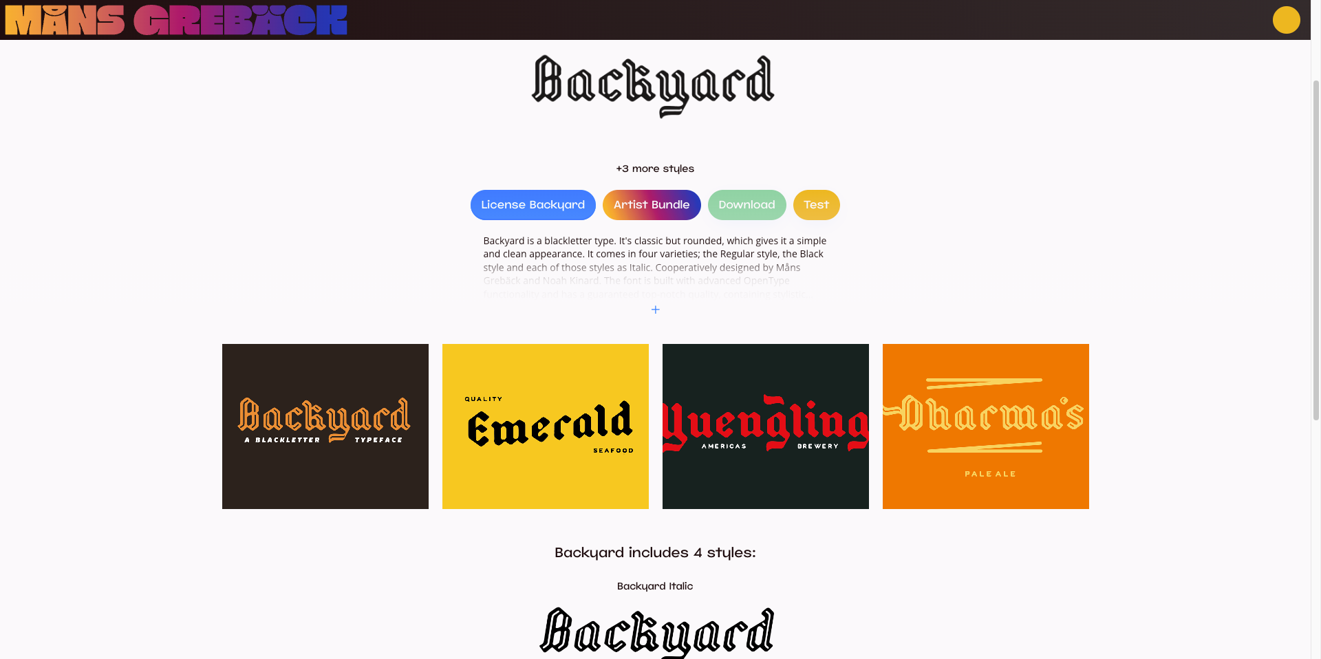
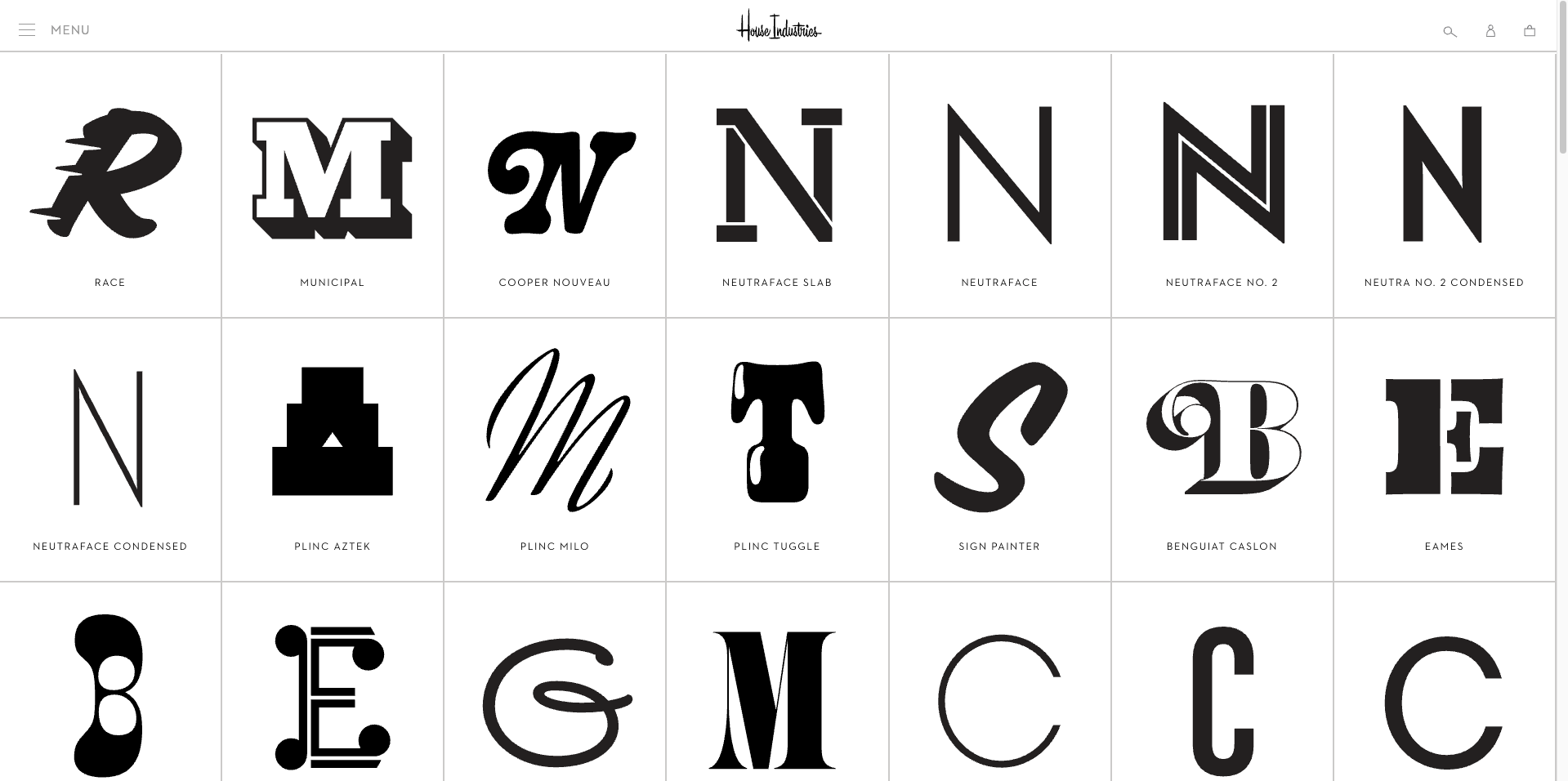
Type explorations (clockwise from top left), BN Nickerson Studio, Floodfont’s Ferryman, House Industries, and Mans Grebäck.
#4 Experiment on the computer.
Alright. Time to move the work to the computer, because I need to do the tedious part—finding good typefaces. Usually I leave this part for later. In my experience, having a symbol makes it easier to find type because you’re trying to pair it with something. Trying to find type without anything else is hell.
Unfortunately, or maybe fortunately, Carouse, Carouse! is a newsletter with an unusual name. I’m going to write down what I need on my typography “shopping list.” I suspect the needs will make this search mercifully narrow.
- The name is long. I need type that looks good stacked on top of itself.
- There’s punctuation. I need type with a good comma and exclamation mark.
- The type needs to be scrappy, loose, raucous, and eclectic.
- I want something kind of familiar—inviting. Not too strange.
- I also want something that doesn’t feel too old or fantasy oriented.
- The font should be free. Or rather, not cost me or the crew anything.
[Insert an hour of looking at typefaces online.]
Alright. I have two new ideas forming from looking at typefaces. One, I can lean into the eclectic and combine multiple fonts together. I saw that done for a tech company in my research phase. Or, two, I could use this chunky, modern blackletter typeface I found called Ferryman. I found it on Adobe. Since I’m paying for Adobe, I might as well use it, right?
📚
Additional Reading: Finding type is easier when you know what you’re looking at. For a crash course on typography, check out my type primer or list of free fonts.
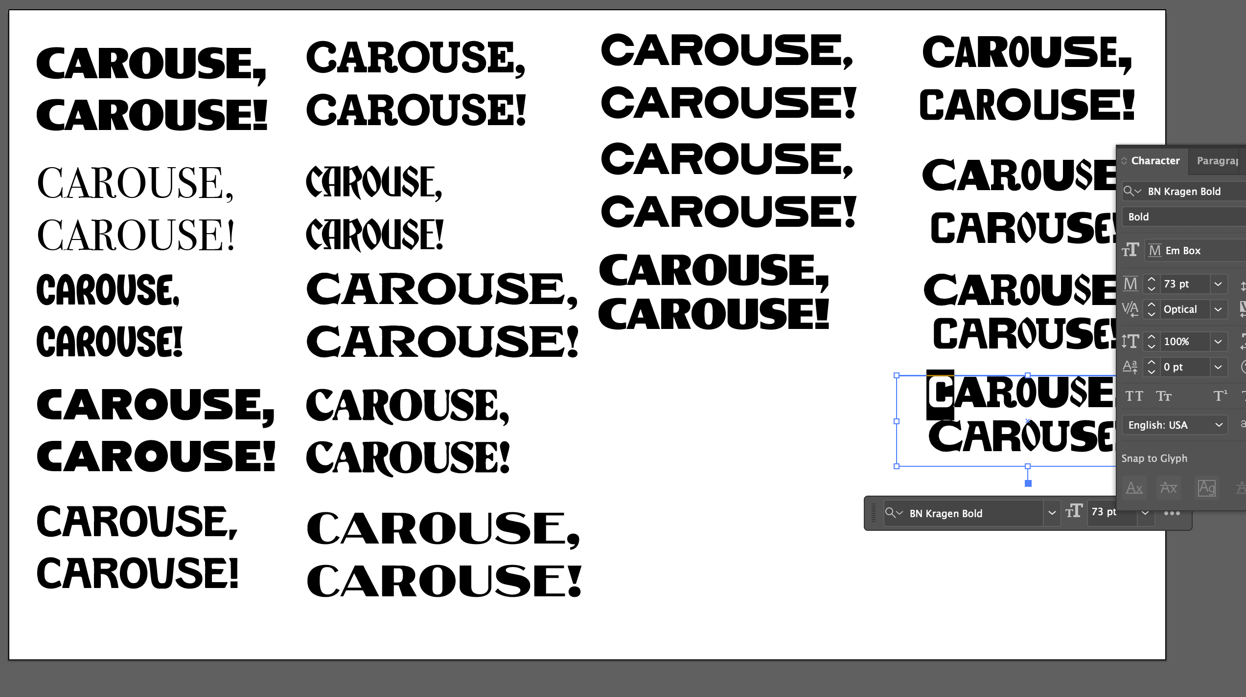
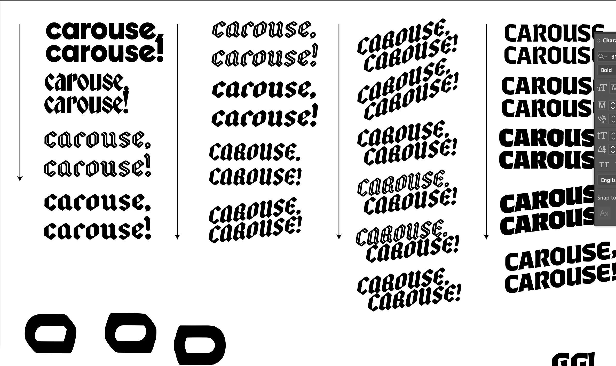
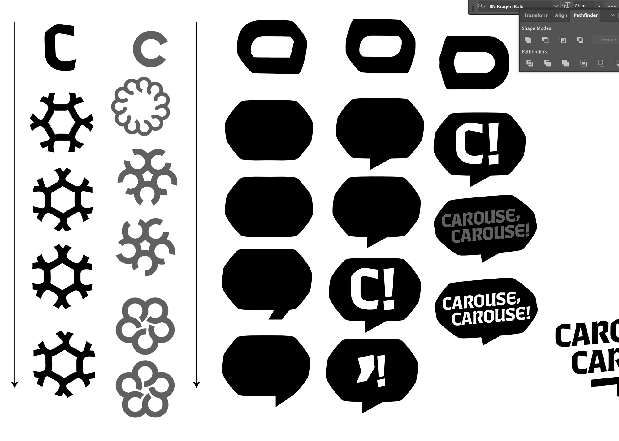
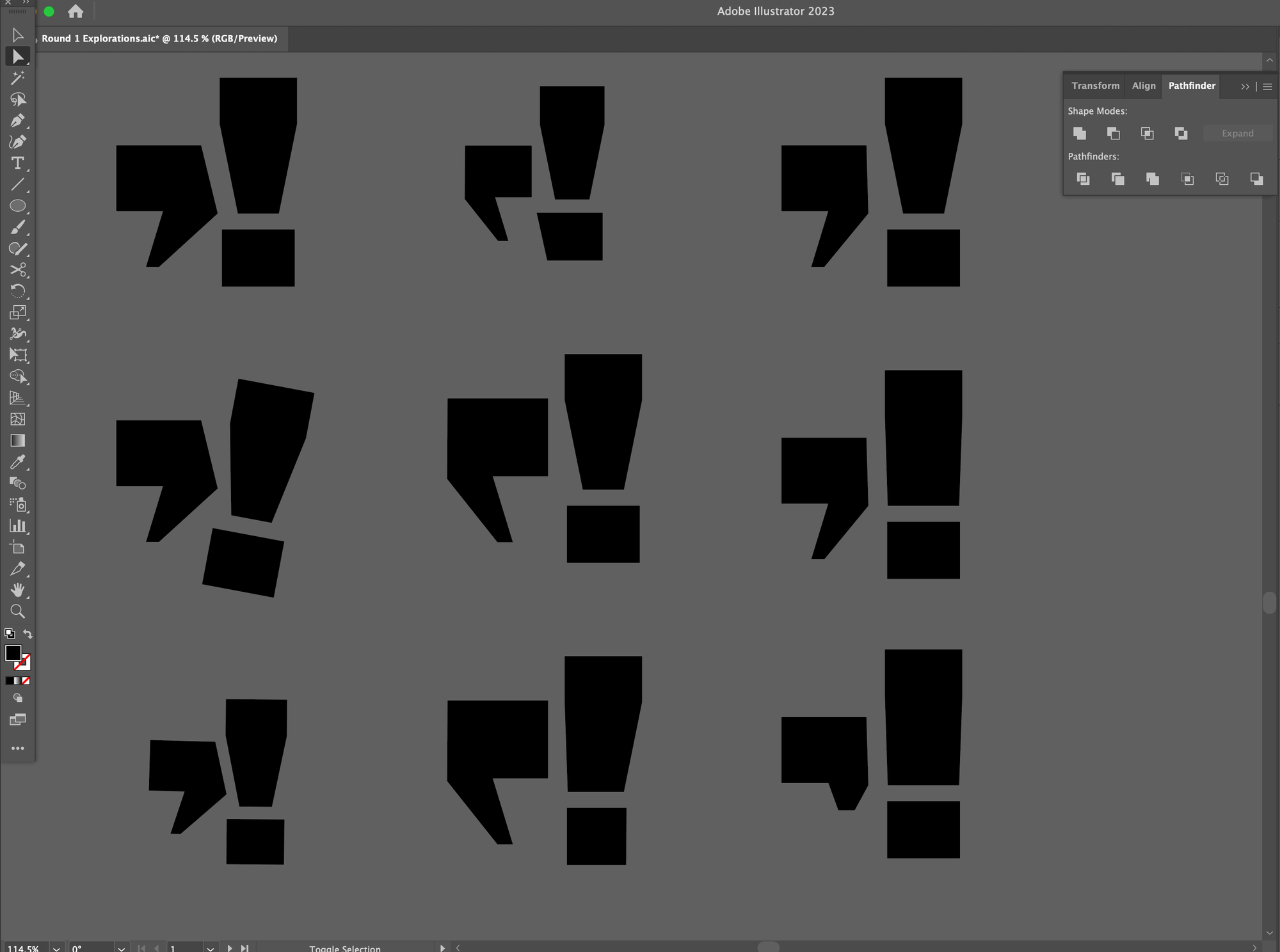
Logo iterations (clockwis from top left): Carouse in Nickerson fonts, Carouse Blackletter, Bubbles and “C” gatherings, Comma and Exclamation pairings.
#5 Iterate on the computer.
This is where I get into my flow state. I have everything I need: strategy, ideas, and disparate design elements. Now I need to combine them, refine them, tweak them, and repeat until I’m sick of it. For the Carouse crew, I’m going to try and show them two rough concepts. Rough in this instance means finished-looking but imperfect—colors, kerning, and all of the fine details will be off. The point of the concepts is to convey the overall idea.
Some designers insist on only sharing one concept. Others insist on sharing 3 or more. My advice? Never show more than 3. Never. Put that 4th runner up in your back pocket for a rainy day. Unless you’re showing clients a dozen rough sketches, you should never be designing 4 or more finished-looking logos for anyone—even if they’re good people like my buddies on Carouse.
Here’s what I do when I’m iterating on my computer:
- Make lots of copies. Did you move something 1 pixel to the left? Duplicate it. Your workspace should be rows and rows of the same logo slowly evolving, devolving, dying off, and being restarted.
- Work in black and white. Colors are a variable that can distract from the other elements. At this stage, you don’t want to waste time finding the right shade of blue or red. Focus on the shape, balance, and more.
- Be wary of “destructive” changes. Destructive changes are ones that can’t be reversed, like rasterizing an image or turning type into outlines. Always duplicate your work with the editable elements before you make a destructive change.
- Organize your file as you go. Future you needs all the help they can get. Keep your iterations in neat rows. Add arrows to show your progression. Sometimes it helps to even add a note or two.
- But keep things messy. Speed is more important than accuracy. If your goal is to see how an idea looks, you can see most of that idea without messing with more complex tools.
📚
Additional reading: Logo design is all about mastering basic design principles. My article, Graphic Design 101, covers a lot of them. You can also print off a cheatsheet from my store.
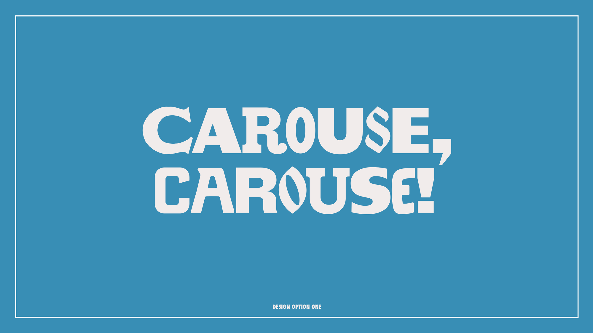
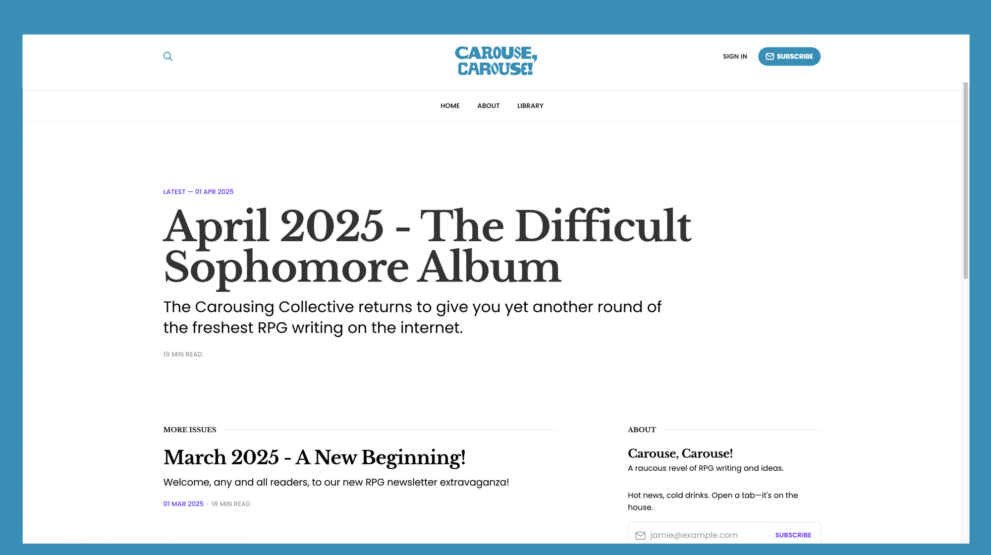
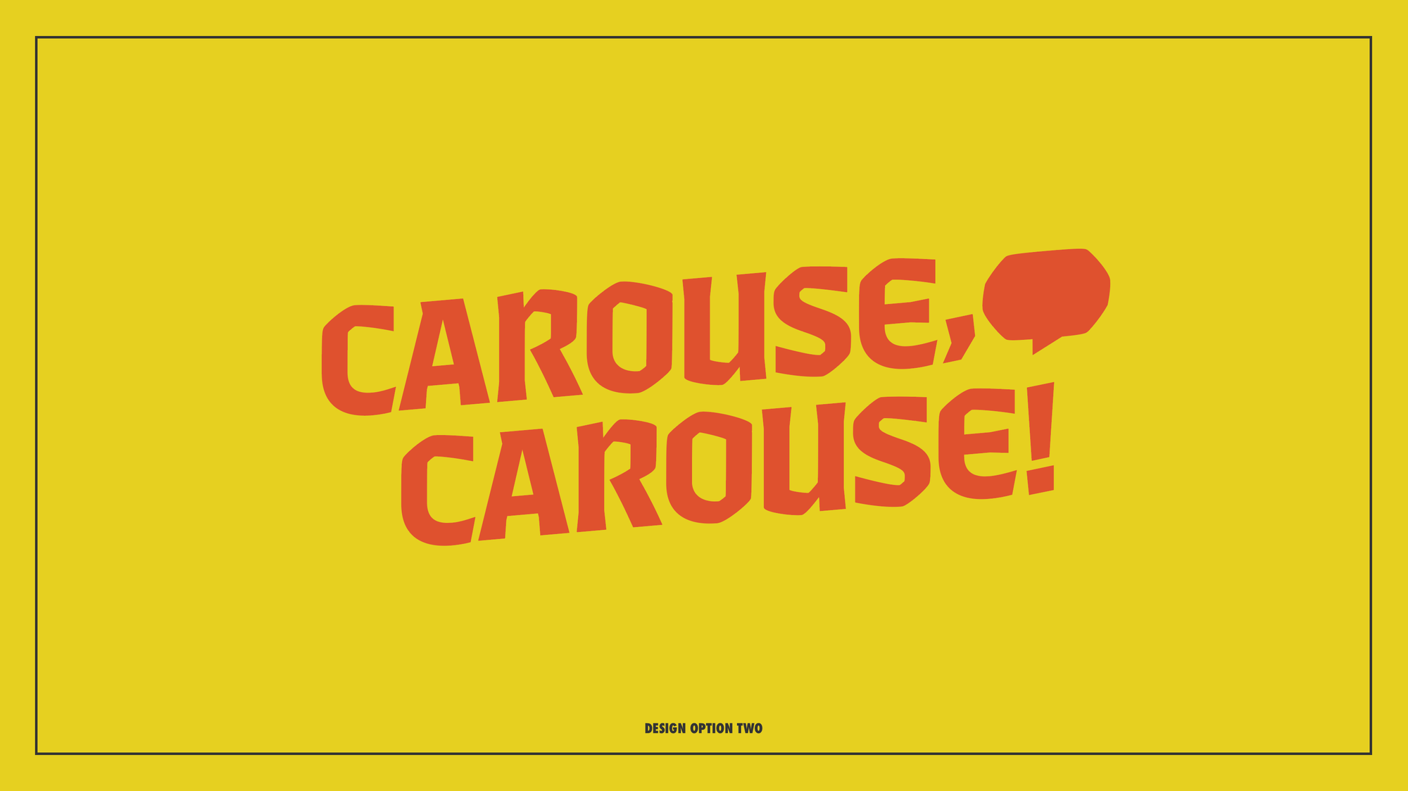
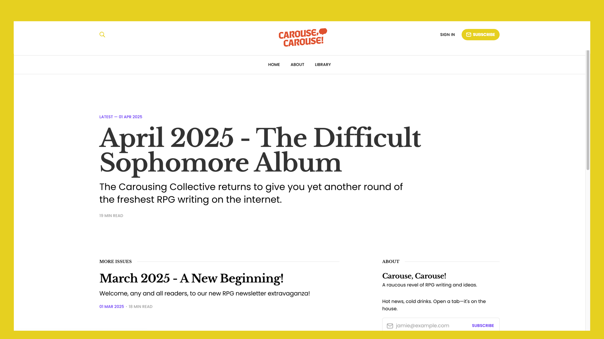
Here are the two directions all that iterating landed on. The website pictures are just images pasted on a screenshot.
#6 Put those logos onto slides.
Okay, I have two concepts I like enough to share. A lot can still change—that’s okay. The goal right now is to share them with the crew and find out which one is the crowd favorite, then I can focus on that one.
Start exploring and building color palettes.
On some projects color gets its own exploration and slides. Since we’re still deciding on a logomark and wordmark, I’m trying to keep things top-level. This can be risky—a lot of people with throw out an entire idea just because they hate the color yellow—so I’m putting a lot of trust into the Carouse crew.
When building a color palette:
- Consider the technical specifications. Where will the logo and brand be used? When I made the logo for Good Luck Press—I was concerned about the colors looking great in print. For Carouse, I need these colors to work on a webpage with an off-white background. My primary color space will be sRGB.
- Consider the competition. I always forget this one. What else is already out there? We want to make sure we don’t have the same colors as our neighbors. So, no Wyrd Science, no Explorateur, and no Rascal News color palettes. We can play with the same primary color families (after all, there aren’t that many), but we need to be mindful how much they resemble each other.
- Maybe think about color theory. (Maybe.) My controversial opinion is that color theory, the psychological study and categorization of color, is so dependent on the culture and context that building your work on color theory is silly. What’s more important is knowing if your client cares about color theory. In my experience, most don’t.
- Leverage color associations. Think about the context, culture, and people behind the brand. Their color associations are more important than any universal theory of color.
Show the logo and its scalable alternatives.
No logo works in all contexts. Some logos are better suited for headers, others for favicons, some for book spines, and others for profile pictures. My usual trick is to take elements from the “primary” logo and recycle them into new forms. The most important logos for Carouse are the masthead and favicon. The rest is optional.
As you might have noticed, the type did end up giving me quite a few ideas about what the symbol or “logomark” could be. In direction 1, I realized the comma and exclamation park in the name were remarkable enough to be an actual mark. In the second direction, I decided the revelry could be represented by a speech bubble. In this case, the speech bubble is made using the same geometry and angles as the wordmark!
Some tips for building your scalable, responsive logo suite:
- Take things for a test run. This is one of those weird projects where I get to actually execute the logos’ implementation, so if something doesn’t quite work, I can always tweak it later. However, that doesn’t mean I won’t make these logos super small to see if they’re still legible.
- Showcase common brand elements. People should be able to recognize the brand even when parts of its logo are missing. The most famous example is probably McDonalds. In the right context, you can recognize the McDonalds brand just from a sliver of the arch or the McDonald’s yellow.
- Prioritize what the brand needs. A “primary logo” is technically a symbol or brandmark paired with a brand name in custom type, but in reality the “primary” logo is whatever gets used the most. Pour your energy into that. In my case, that’s the logo that goes up at the top of the website.
📝
Reminder: Every version of the logo is for specific usecases. If the brandmark you’re using for a favicon looks great but not as a profile picture, that doesn’t mean it’s a bad favicon.
#7 Present the work. Feel nothing.
Emphasis on that last part. Remember: It’s just a silly logo. It’s not cancer research (even if it’s a logo for a cancer research center). There will always be changes after the first round of presenting. That’s normal.
Normally, I share logos on a Zoom call. It makes addressing concerns and getting good feedback easier (re: possible). In this case, however, I’m going to keep things fast and loose by sharing the logos on Discord. Once the majority of the group has weighed in, I’ll make invisible tweaks that only me—a sicko—will notice, and then share a ton of different color combinations.
Some quick tips if you’re presenting the work:
- Keep things fun and light. Design is supposed to be fun! Clients and collaborators that laugh, smile, or get pumped up by the work are more likely to trust you with the creative idea.
- Never downplay or undermine the work. Don’t undersell the work. It might seem like you’re being humble and practical, but in reality it makes you sound like you don’t like it—so why should they? Instead of saying, “If they’re total crap, I can do it all over…” Try saying, “I’m excited to keep working on one of these. It’s been a fun challenge.” (I might have failed this on Carouse…)
- Ask for feelings. Not solutions. “How is this feeling? What do we like? What don’t we not like? Is there anything you’re excited by?” People are never wrong when they share their feelings, but they’re seldom right when sharing a solution. The reason is really simple: they didn’t make a hundred iterations and try every idea like you did. Just nod, say thank you, and ask how they feel.
- Return to the strategy and research. When you ask for feedback, remember to relate the questions and answers to the strategy. If they say they don’t like a concept, ask them, “It seems like it’s not right for Carouse, then. Why do you think that is?”
📙
Bonus Lesson: You don’t have to be regular old you when you present work. If being a designer makes you uncomfortable, create an alternative version of yourself and roleplay that character.
#8 Make revisions. Make mistakes.
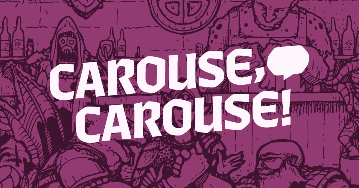
We’re nearing the end of this project. The other Carouse folks are pretty excited by where we’re headed (and I am too). I landed on a warm plum color, chunky type, and a fun little speech bubble for a secondary logo. Now I need to package things out correctly, put them into UI, and fix every silly mistake I made.
The silly little mistakes I made:
- Once again, I’ve exported visuals as a JPG and the colors came out modified. I’ll have to increase the file size and make sure the color profile is sRGB (digital color profile for the internet). Always compare side by side.
- The favicon was looking weirdly squished. It turns out my artboard with the speech bubble wasn’t perfectly square, so the browser was warping the image.
- The preview image for the website’s home page was empty. That simply won’t do. The good news is that we have John Bilodeau as a collaborator and artist, so all I have to do is grab one of his illustrations from the newsletter and combine it with the new logo and color palette.
- I had to make 10 different favicons. All of them looked good small, but I didn’t consider how the browser tabs would make them look… silly. Fixed?
Final Thoughts
A fun and painless little passion project! My collaboration was a lot different here, so don’t mirror this exact process if you’re doing paid work. In that kind of setup, I would work to a scope and project timeline. This was with friends, so I was willing to be inefficient and just bumble through it.
Here’s the final result with a nice little preview image…
Carouse, Carouse!
A raucous revel of RPG writing and ideas.
 Carouse, Carouse!

Explorers Design is a production of Clayton Notestine. If you liked this article, please consider liking, sharing, and subscribing. Members who pay $5/month also get access to additional tools, templates, and inspiration.
